Test controller, chart layout
This popup makes it easy to customise the chart, this functionality is also available from scripting. The customisation includes colors, changing the axis names, combining scales and adding annotations to the chart. Colors and names will also be used on the Histogram page. This popup can be opened from right clicking on a chart and selecting layout (It is not accessible from the Popups button)
This function can be used to improve a chart when it has to be shown for other people.
Contents
Customising colors
Customising names
Synchronising scales
Annotations
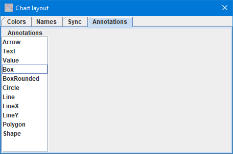
Annotations parameters
Arrow
Text
Value
Box
BoxRounded
Circle
Line
LineX
LineY
Curve
Polygon
PolyLine
Shape
Generating script
Scripting
Main page
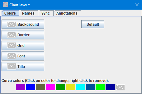
Customising colors
Click on the buttons to adjust the color, the symbol with the white X means default color is used.
The colored line at the bottom can also be adjusted by clicking on the color patches and more colors can be added by clicking on the X at the end.
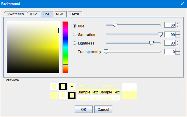
The Java color selector, there is multiple ways to select a color, depending on selected page.
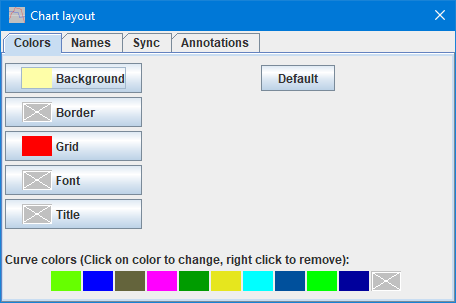
A chart with some changed colors.
Use the "Default" button to restore the original colors.
The "Title" color is only used when saving charts.
Customising names
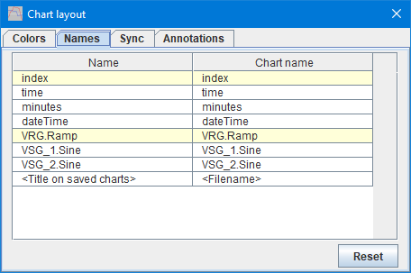
This page list all the axis names and the name used on the chart.
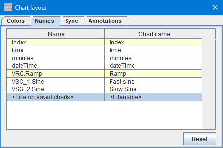
Click on the "Chart name" for a axis and it can be changed.
And the axis on the chart will show the new names (Anywhere else in TestController the original name is used).
The last entry "Title on saved charts" can be used to override the default title for a saved chart.
Synchronising scales
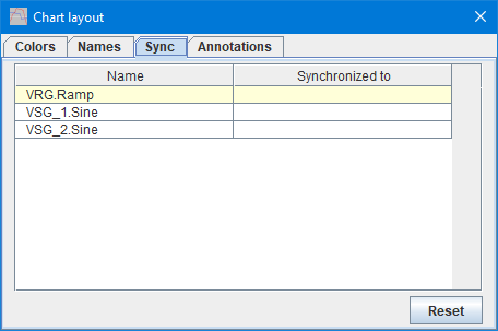
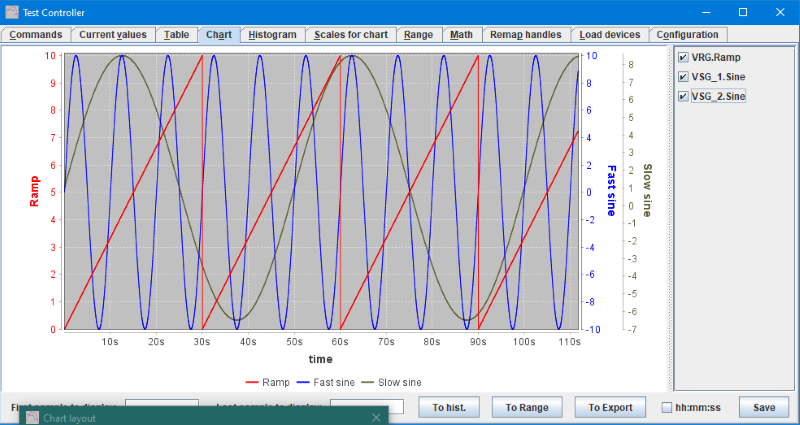
With this page it is possible to combine scales for curves.
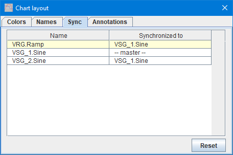
Here the scale for VSG_1.Sine is used for all 3 curves
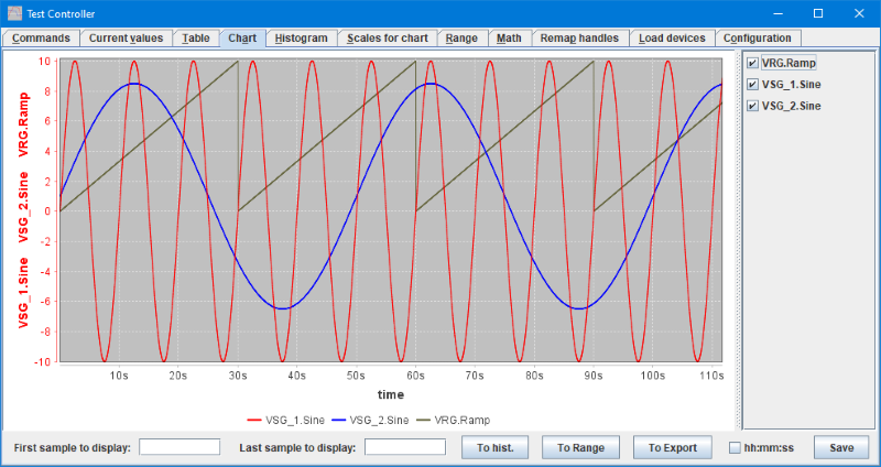
And the result looks this way.
There is a caveat when using this function: The "master" scale but be first, this can be fixed by unchecking and the checking it (on the right side of the chart).
Annotations
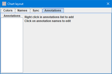
On the annotation page one or more annotations can be added to the chart.
Here I have added most the different annotations. Click on a name to edit that annotation.
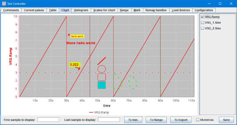
A demonstration of the different annotations.
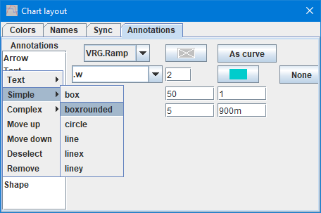
The right click menu will change depending on what is possible:
- Text, Simple, Complex : These are always present and the different annotations can be found here.
- Move up: Move the selected annotation up the list, only relevant when there are overlapping annotations.
- Move down: Move the selected annotation down the list, only relevant when there are overlapping annotations.
- Deselect: No annotation is selected and the edit part will be empty.
- Remove: Remove a annotation from the list.
Annotations parameters
Arrow
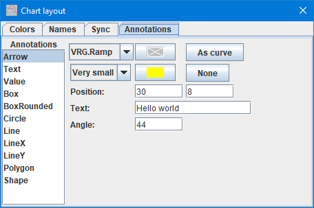
The arrow is a arrow with some associated text.
- What curve it is linked to and a possible color override.
- Size of arrow and text and possible background color for text, default is to use the chart background.
- Position in X and Y coordinates, X will typical be in seconds and Y will match the linked curve or the left scale if not linked.
- The text
- Direction to point the arrow in, 0=Text to the right, =Text above the arrow, -=Text below arrow. Actual placement of text changes at 45 degree, from left/right, to above/below.
Text
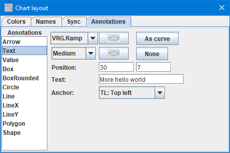
Place some text in the chart.
- What curve it is linked to and a possible color override.
- Size of arrow and text and possible background color for text, default is to use the chart background.
- Position in X and Y coordinates, X will typical be in seconds and Y will match the linked curve or the left scale if not linked.
- The text
- Where in the text the position is specified. Text can be placed anywhere without using this value, but will not move correctly if the size of the chart is changed.
Value
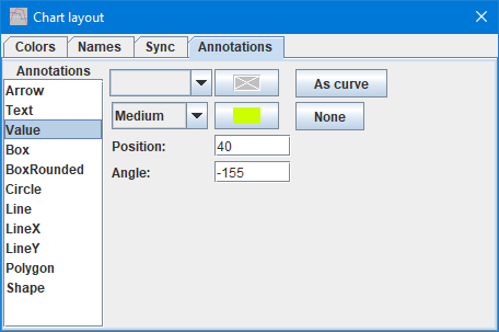
The value is a arrow with some associated value from the linked curve.
- What curve it is linked to and a possible color override.
- Size of arrow and text and possible background color for text, default is to use the chart background.
- Only X position is specified, the Y position is assumed to be where the curve is and this value is also shown as the text.
- Direction to point the arrow in, 0=Text to the right, =Text above the arrow, -=Text below arrow. Actual placement of text changes at 45 degree, from left/right, to above/below.
Box
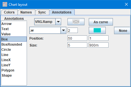
A box, that can optionally be filled with a color.
- What curve it is linked to and a possible color override.
- Line style and thickness, then a possible fill color.
- Position in X and Y coordinates, X will typical be in seconds and Y will match the linked curve or the left scale if not linked.
- Size of the box with width and height.
BoxRounded
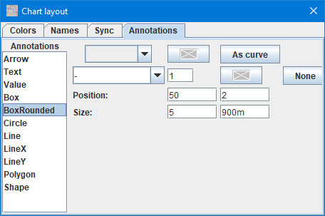
A box with rounded corners, that can optionally be filled with a color.
- What curve it is linked to and a possible color override.
- Line style and thickness, then a possible fill color.
- Position in X and Y coordinates, X will typical be in seconds and Y will match the linked curve or the left scale if not linked.
- Size of the box with width and height.
Circle
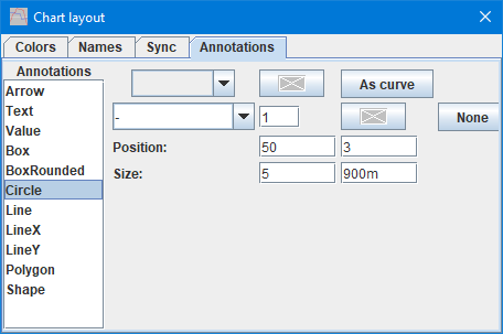
A circle or ellipse, that can optionally be filled with a color.
- What curve it is linked to and a possible color override.
- Line style and thickness, then a possible fill color.
- Position in X and Y coordinates, X will typical be in seconds and Y will match the linked curve or the left scale if not linked.
- Size of the circle with width and height specifying the surrounding box.
Line
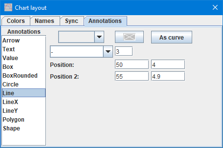
A line (Use PolyLine when connected lines are required).
- What curve it is linked to and a possible color override.
- Line style and thickness
- Position in X and Y coordinates, for starting point.
- Position in X and Y coordinates, for ending point.
LineX
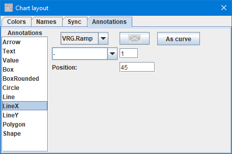
A vertical line with only the X coordinate specified.
- What curve it is linked to and a possible color override.
- Line style and thickness
- Position of line, this is the X coordinate (I.e. time with default X-axis).
LineY
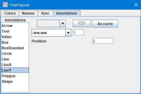
A horizontal line with only the Y coordinate specified.
- What curve it is linked to and a possible color override.
- Line style and thickness
- Position on the data scale, this is the Y coordinate.
Curve
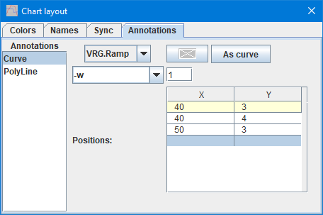
Smoothly connected line segment, that will form a curve
- What curve it is linked to and a possible color override.
- Line style and thickness
- Table of X and Y position for the line segments, due to the smoothing the curve will seldom reach these points.
Polygon
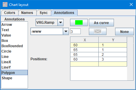
A closed figure made from line segments.
- What curve it is linked to and a possible color override.
- Line style and thickness
- Table of X and Y position for the line segments, the closing line segment will be added by the drawing function.
PolyLine
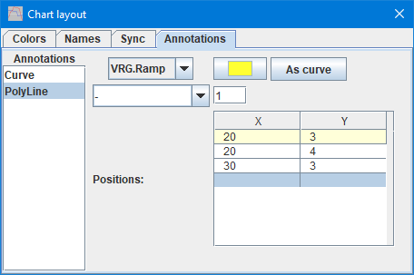
Connected line segments.
- What curve it is linked to and a possible color override.
- Line style and thickness
- Table of X and Y position for the line segments.
Shape
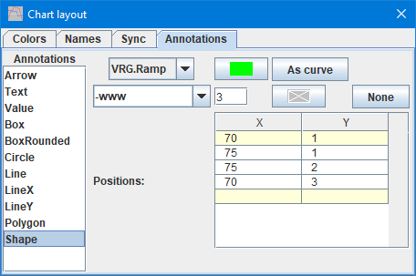
A closed figure made from smoothed line segments.
- What curve it is linked to and a possible color override.
- Line style and thickness
- Table of X and Y position for the line segments, the closing line segment will be added by the drawing function. Due to the smoothing the curve will seldom reach these points.
Generating script
When this popup is open a option to generate a script for the chart is added to the generate script menu:
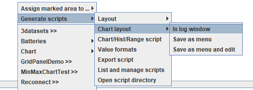
This will generate a script to restore the exact layout that the chart has now. It includes setting for the currently shown data.
Scripting
This popup cannot be controlled with scripting, but all the functions can be duplicated with script commands:
#CHARTCOLORS color{ color{ color{...}}}
#CHARTSCALENAME originalName newName
#CHARTSCALESYNC {reference sync1{ sync2{ ...}}}
#CHARTANNOTATE ...